In 1998, the internet was really, really exciting. It was also atrociously designed. But now in 2021, web designers are returning to their roots. Mae Losasso investigates.

For my 6th birthday, my parents gave me a computer. It was 1998, and the machine was a huge, chunky, Windows affair, all beige plastic with an array of beige accessories – a thick-buttoned keyboard; a clicky mouse; standing speakers with little volume dials; an adjustable plastic microphone – all, of course, connected with wires.
I used that computer to draw pictures on Paintbox, mostly, and to play a few games that ran on CD-ROMS. The internet was a thing, yes, but you had to dial into it, and every time you did it made an interminable screechy sound. It also made the phone lines go dead: if you picked up a phone (another big, beige, plasticky thing) while you were on the internet, that horrible screech was there, like a dementor, chatting idly away on the other end.

At first, I wasn’t allowed to use the internet unsupervised. It was a dangerous place, my parents said – and, also, it cost money to dial into the modem. So ‘surfing the web’ was always an event – although I was never quite sure what to do when I got onto it. Often I would go to the browser ‘AskJeeves’, which had a little picture of a suited butler, and I’d ask him various questions, like an oracle.
Web pages themselves tended to be information repositories: you couldn’t really do much on them, except click the buttons and get whisked (no, not whisked, churned – the speed was grindingly slow) from page to page. In those early days, it seems, there was no real concept of web design: the sites tended to be grey, with lots of linked text, in black or white or garish primary colours. There was no infinite scroll, no embedded videos or carousels, no proliferation of glossy photographs, no shops, no social media, and no immersive interfaces. It was just grey, and text, and buttons, and blocks. And, in 1998, it was really, really exciting.

A certain way of thinking
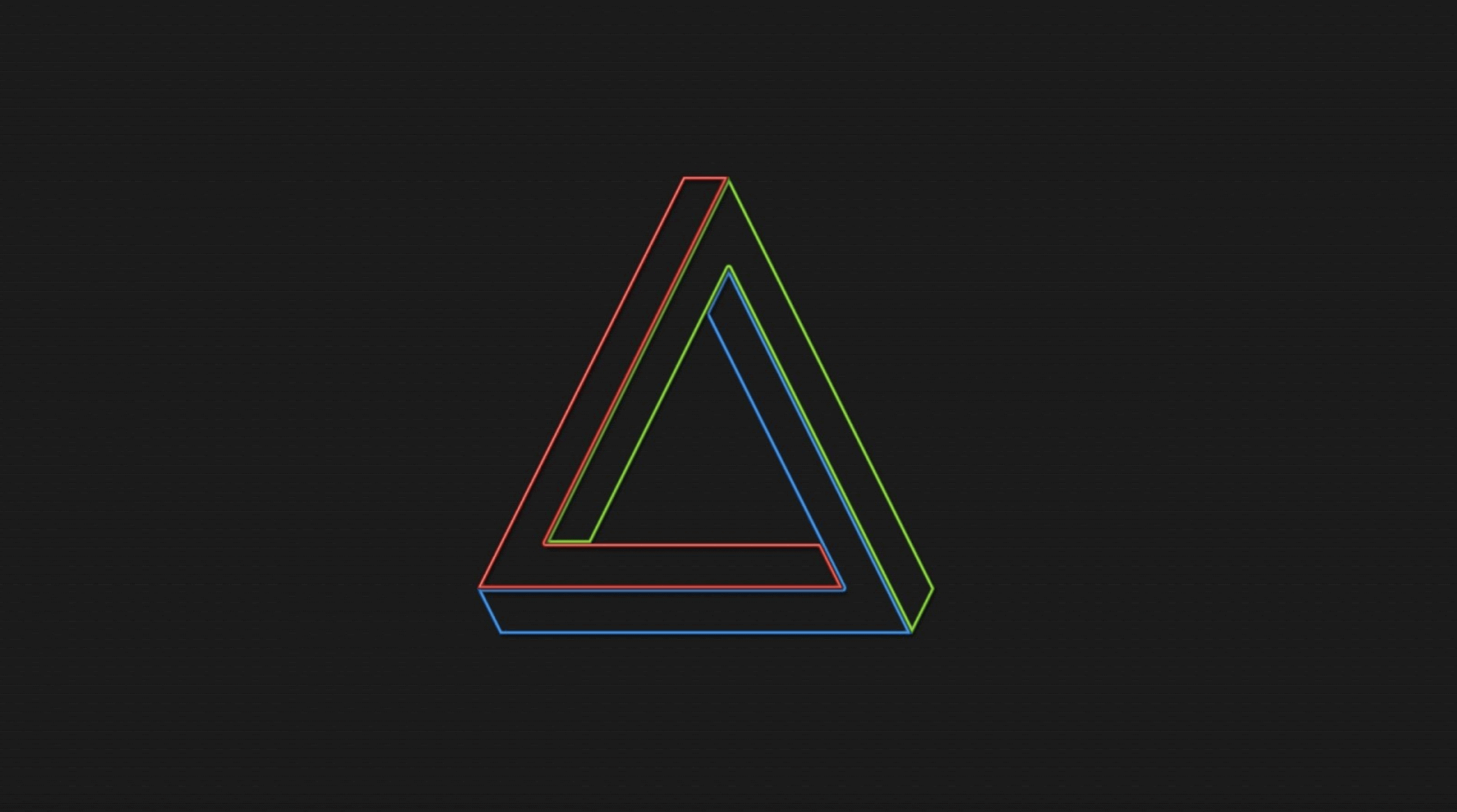
A few months ago, I was looking up the ICA and I found myself on their website. For a split second, I thought that something had glitched, or that I was on the wrong site – the website of a small-fry gallery that hadn’t been updated since 1999. There was the light grey background, the bright primary colours, the plain black text, and the finite scroll, crashing comfortably into a footer at the bottom of the page. But as I watched the little red, green and blue bubbles meet and diverge in the left-hand corner, I knew, suddenly, that this was no out-of-date page caught in the annals of the past. This was the future.
Designed five years ago, the ICA’s website has since spawned a number of similarly 90s-esque sites – like, for example, Nottingham Contemporary’s, which follows suit with greys and primaries and big analogue clocks. But it hasn’t always been this way. When the current iteration of the ICA website first went live, it sent shockwaves through the institution.“Certainly when the ICA website started,” head of design at the ICA, Stuart Bertolotti-Bailey, tells me, “there were a lot of people internally and externally, who were pretty upset about it. Because it just didn’t look and work like a normal website. It was hard-sell for a while.”

Yet, for all of its innovation, Bailey doesn’t think of the site – or the ICA branding more broadly – in terms of an aesthetic, per se. “David [Reinfurt, his design partner] and I have never really approached this website, or graphic design in general, as a sort of aesthetic project. It’s much more that the way things end up looking, sort of fall as a logical consequence of a certain way of thinking.” Bailey was brought in as head of design at the ICA five years ago, when Stefan Kalmár stepped in as director.
Five years before that, Kalmár had commissioned a video installation from Bailey and Reinfurt, which he exhibited at Artists Space, NYC, where he was then executive director. The piece, called Identity, was “a sort of a high speed history of graphic design over the past 120 years, and also a case study of 3 identities, which are: Pompidou, the Tate and MoMA.” When he moved to the ICA, Kalmár invited Bailey and Reinfurt to “redesign the whole identity, including everything, the website, whatever. And it just seemed like, well this is an opportunity to put this theory [of institutional identity] into practice.”

Form follows function
That’s what Bailey means when he says that the ICA’s aesthetic is an extension of its ethos. Take the logo, for example, which, Bailey explains, “is a reuse of one of the earliest visual renderings of ICA by Richard Hamilton, from a poster that was made for the ICA in 1950. Part of the idea about this – apart from the fact that I love Hamilton’s work anyway – is that when he used it on this poster, it wasn’t a logo.
It was, I think, made from big wood blocks that were just found in a print room, and that’s interesting to me and David, because it’s from a time before logos in a way. And so we’ve adopted it, partly as a wink to the ICA’s past, partly as an act of wilful recycling, and also because we just liked the look of it.”

And then there’s the use of RGB on light grey. “The idea for that,” Bailey says, “was super simple. It came off the back of the fact that the former ICA website and identity had been very, very back and white for a long time. So it was like, let’s just do the opposite of that and be very, very colourful.
And then there was the idea of RGB being digital primary colours: if the majority of things that we’re going to produce at the ICA are going to be digital rather than print, then why wouldn’t we base everything on digital primary? And that seemed unusual at that time.” The grey, he admits, “wasn’t really an idea at the beginning, and I forget how that came about. But once we’d made that grey website background, we realised two things about it: one, is that it immediately gives you the option of using white as an extra colour. And, two, that it automatically makes the images pop more, as if they’re on a light box.”

Brutal honesty
Bailey’s eye for detail, for precision (especially in terms of textual and grammatical perfection), for theory, and for concept, betrays his background in typography and book design – which also explains why his graphic style goes against the grain of the mainstream. “There’s a distinction,” he says, “between people coming to graphic design intellectually – from reading, from books – versus [those coming] from marketing and PR. I think that the majority of websites that […] are mainly image-based definitely come from the idea of the image as shorthand, social media, image-based culture, data gathering of audience expectations, etc. Which tends to make stuff, gradually over time, and inevitably, all work and look the same way, like any fashion.”
But it’s more than fashion: it’s also something to do with honesty. “I tend to think of it more as a one-to-one reflection on the nature of the material,” Bailey says. “What you see is what you get.” It’s a design ethos that also informed Brutalist and, later, high-tech architectural styles – which might explain why, as web developer Chris Corby tells me, “the late 90s nostalgic web aesthetic [is] sometimes called ‘brutalist’ – which must be upsetting to history fans.”

An independent web developer based in Brighton, specialising in bespoke website builds, Corby shares Bailey’s investment in a kind of honesty. “A particular kind of site I love,” he tells me, “is one which looks out of date, and in some ways ugly, but the content is so brilliant that it doesn’t matter. There is something so authentic about them. The lack of design trends seem to make them more trustworthy, not less. Sometimes these sites will have a garish PayPal button at the bottom –these are my favourites.”
Co-designed with graphic designer Sean Purdy – who, like Bailey, is evangelical about typography – Corby’s sites don’t exactly resemble the ICA’s or Nottingham Contemporary’s – none of the grey, the primary colours, or the blockiness – but they do have a certain elegant simplicity, a stripped-backness, an emphasis on typography, and an eye for the tiniest of details that fits with the retro pattern I’m spotting. There’s not a garish Paypal button in sight – but there is something honest, something authentic, about these sites. Without the smoke and mirrors that comes with so many custom built sites, I trust these refined ones, implicitly.

Of points and polygons
But, as Corby says, the 90s aesthetic “does not really extend to development. Most developers would not want to work with 90s HTML code anymore – which is why many avoid email templates like the plague! There are regular small wars waged in the development community around tooling though, and the best way to build sites. The prevailing wind in development tooling is overcomplication, but there are some who favour a stripped back approach. Here it has some parallels with 90s aesthetics, being a counter reaction to overcomplicated interfaces (e.g. the monstrosity that is Facebook).”
The distinction between design and development is, of course, important – the builders of these online architectures aren’t thinking about how to 90s-ify their sites because, as Corby points out, that would make them intolerable from a user perspective. But Corby does share Bailey’s more intellectual approach to web development, and his tendency to work closely with artists betrays that: not only Purdy, but a host of artists, novelists, publishers, and other experimental projects (including a clock that tells the time with only points and polygons). “When working on my own projects or collaborating earlier on in the process, I tend to spend a long time thinking about the site before getting into coding,” Corby explains.

A case in point is his collaborative site design for the artist Ashley Sheekey, where the website itself became an element of her praxis. “On Ashley’s site,” he tells me, “we spoke for months about what the site should be, who it was for, and what purpose it served, before finally committing to a direction and building it in about a 1 month burst while in Wales.
There are a lot of norms in web design now. There are good reasons for a lot of these – people recognise underlined text as links – but others need questioning. On Ashley’s site we arrived at thinking of the whole thing as a searchable archive and took it from there. This was informed by her practice and the work she had and wanted to show. In this way, the site was built around her, whereas a template or theme would demand that she fit her work around it.” Sheekey’s site has since been featured on both HOVERSTAT.ES as well as TypeWolf, where it appeared as ‘Site of the Day’ – evidence that, as Corby points out, “integrating [design and development] more closely leads to more interesting directions.”

The end of the infinite scroll?
What, then, is the future of web design? Will we disappear, further and further, into the rabbit hole of the infinite scroll? Or will sites like Corby’s, like the ICA’s, like Nottingham Contemporary’s become the norm? In other words, are we beginning to see a return to 90s aesthetics, or are these the outliers? “I think, probably, it’s inevitable – in an inevitably capitalistic way – that the sorts of things we’re doing now will become sought after, simply because they seem to be a bit different and a bit weird,” Bailey says. “It is what it is.”
It wouldn’t be the first time that something like this has happened: in the 1960s and 70s, the Italian art movement known as ‘anti-design’, which ran roughly parallel with the rise of postmodern aesthetics, emerged as an explicit challenge to the sculptural abstraction of mainstream modernism. Like Bailey’s design for the ICA, the Italian movement emphasised striking colours, irony and kitsch. It was radical, intelligent, socially rebellious – and, as Bailey predicts for his own aesthetic, quickly got sucked up by the mainstream.
Then again, there’s something about the quiet anti-design of these websites – both structurally and superficially – that strikes me as enduring, especially from the point of view of development. Because, as Corby notes, “to be an efficient developer you have to resist reinventing the wheel. There is no point writing a button component eight times a year.
It is better to write it once in a more abstract way and repurpose it each time to a new design.” In other words, the honesty and the elegance of these sites isn’t gimmicky, it’s intelligent, and though CMS’s may try to ape them, they’ll struggle to capture the beauty of a bespoke collaboration between designer and developer. Fusing contemporary techniques with functional – and sometimes rebellious – design, these sites are built to last – and to evolve, gradually and sensitively, over time.