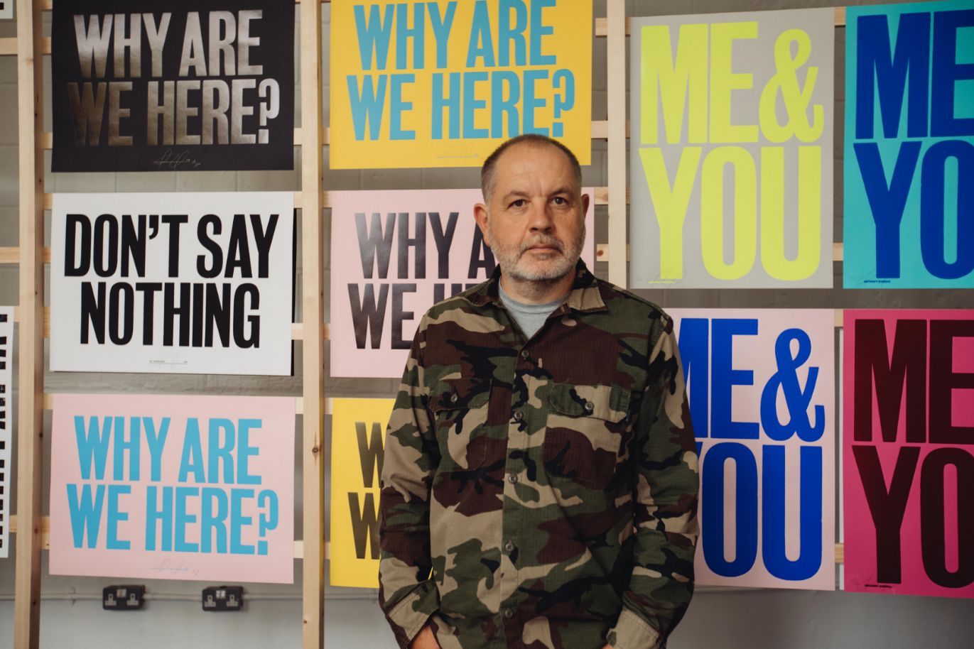
The Lancashire-born typesetter artist reveals how he instils beauty and transmits power through short, printed messages.
From the off, what’s so striking about Anthony Burrill is the complete divide between his disposition when chatting to him and his art. Although both are considered and measured, Mr Burrill, the conversationalist, is soft and reactive, a far cry from his loud declarations on canvas.
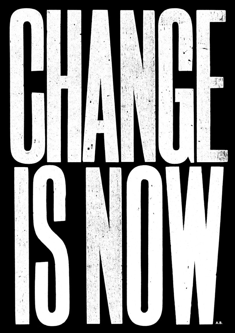
But the bold axioms also speak of a quiet simplicity, one Anthony attributes to his modest upbringing in Littleborough, Lancashire; a northern town and region in a country for which the more terse one’s life philosophy is, the better. These messages are the journaled musings Anthony hears every day: things we tell ourselves to get up, dust off, and keep going; or the curt affection we yearn for from a loved one.
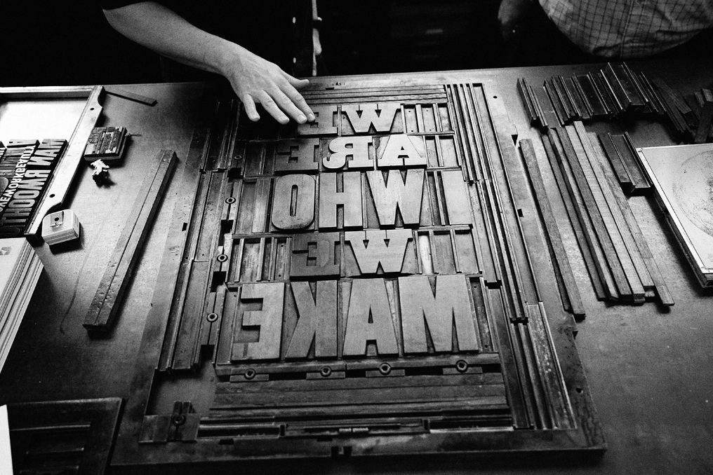
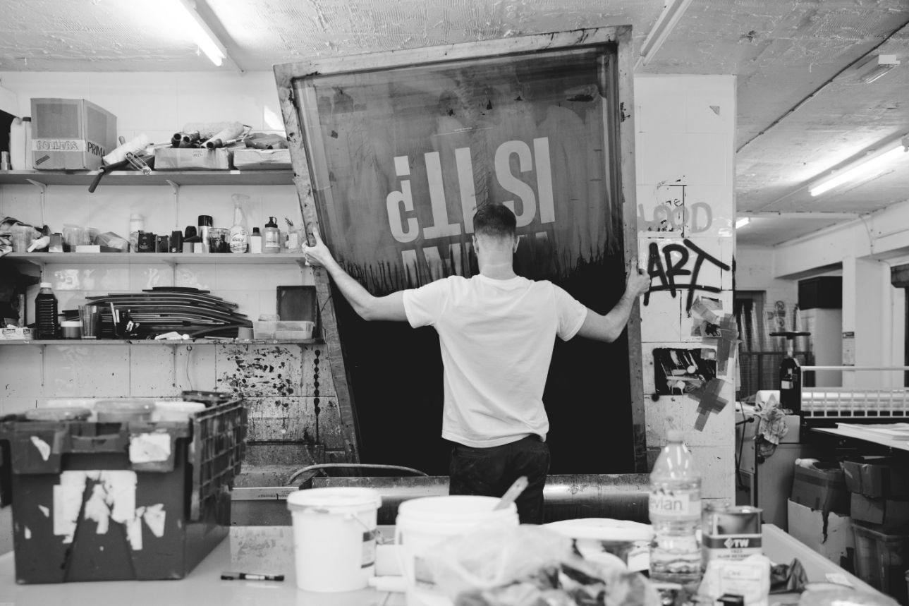
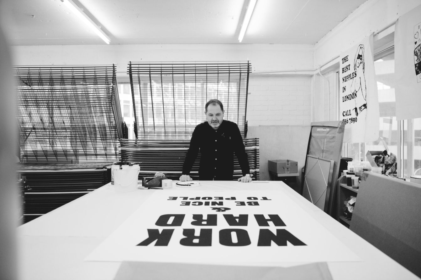
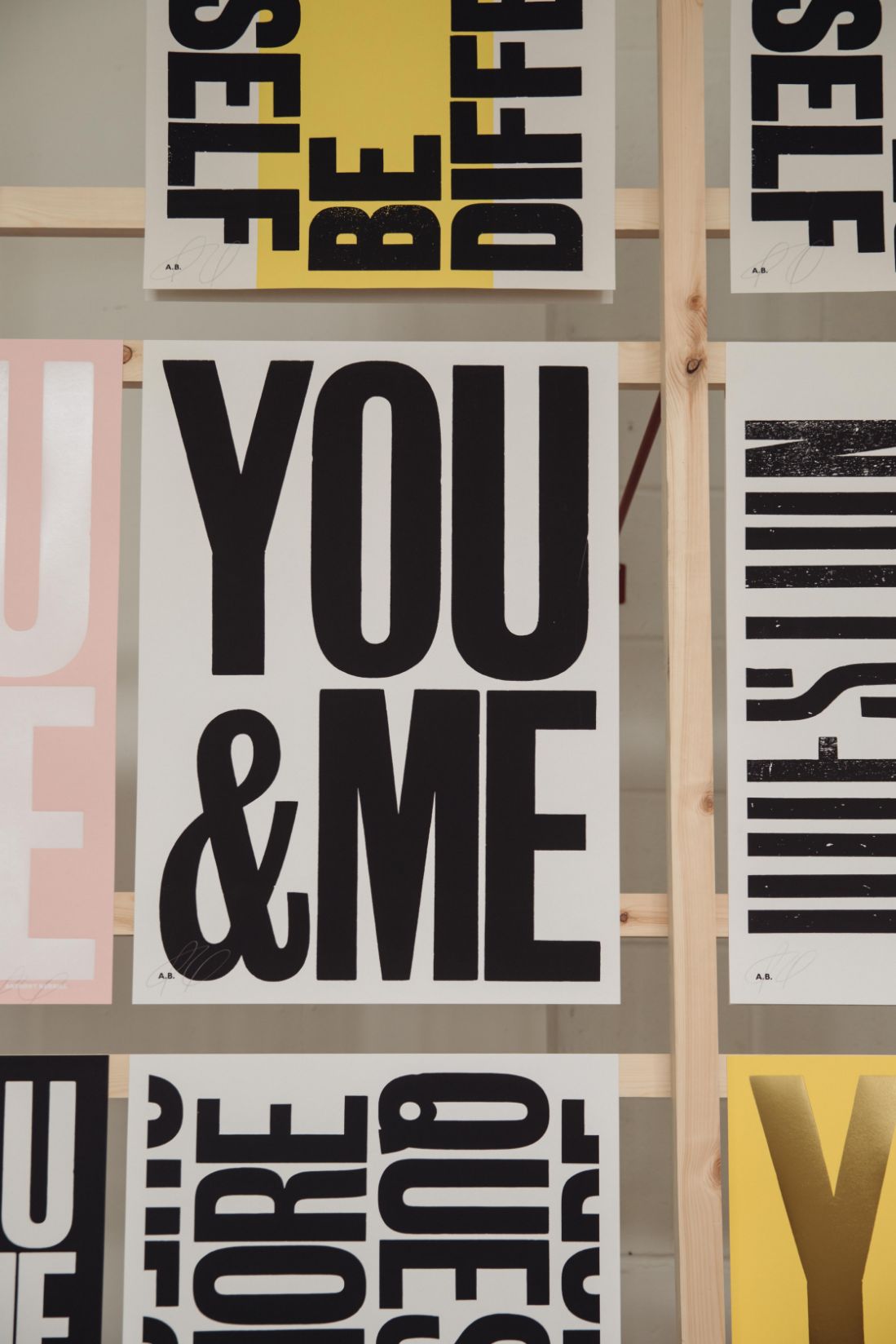
All of this is built physically after he’s conceived it. Anthony works with centuries-old letterpress machines, wood type, and a gargantuan Heidelberg Cylinder Press. And so, when we learn that, we appreciate much more the difficulty print artists like Anthony face in sourcing and buying equipment before the big issue, the restrictions: what lettering, colourings and ink, size and format.
For Anthony, this is part of the appeal, part of the magic. ‘That’s where it all lies,’ he says, ‘working within these restrictions. When I’m talking to students about what’s available to us now, there’s an infinite amount of resources if you choose to look at typography from a digital perspective. But with specific typefaces, with two colours, it’s all reduction. Reduction in art, like in music and architecture, when things are stripped down to the bare essentials, that’s where the real truth and beauty lie.’
Presumptuous philistines like me take a cursory glance at Anthony’s work on a wall or online and assume it’s been designed on a computer with expensive software, such is how beleaguered the imagination can be with most advertising (and, let’s face it, propaganda) being digitally drafted. But it’s important to recognise how artists like Anthony have painstakingly learned the almost-immemorial craft of typesetting (evidence of the practice can be traced back to the second millennium BC in the Fertile Crescent), rather than learning how to design on a Mac or PC, sat comfortably at an ink-free desk. Granted, he had no choice (having learnt to typeset in the 80s and 90s before personal computers could be used for anything other than a word processor or calculators) but the fact of the matter still stands: Anthony is one of a few thousand people the world-over who are keeping this craft alive.
It was the DIY zine graphics of his youth that made Anthony fall in love. ‘I used to use the photocopier in the studio at college to make my own stuff. I’d get type samples and photocopy them to blow them up, it was that raw, zine-like effect that I really liked. It felt immediate and full of energy.’
Anthony’s genesis as an artist started small-scale, with ‘mail art’ (mail art began in the 1960s when artists sent postcards inscribed with poems or drawings through the post rather than exhibiting or selling them through conventional commercial channels). ‘I just kept hold of that aesthetic,’ Anthony explains, ‘Even later on, in the 90s when I got an iMac, I still held on to that lo-fi look. Now, the way I use the computer is pretty basic.’
Based in Kent since the mid-2000s after leaving London, Anthony’s go-to method of typesetting is with wood type, from an old-fashioned independent shop named Adams of Rye, near where he lives. ‘I use their four or five exclusive typefaces that’re all over a hundred years old. Adams of Rye have a real historic connection with the printed word.’
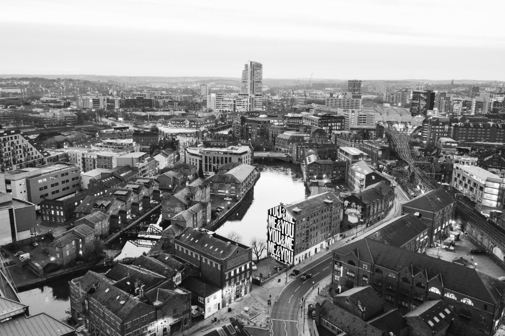
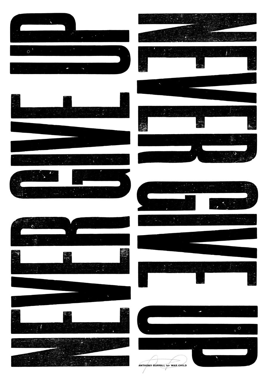
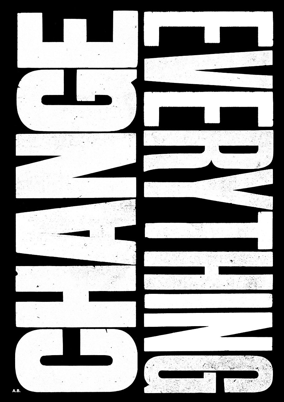
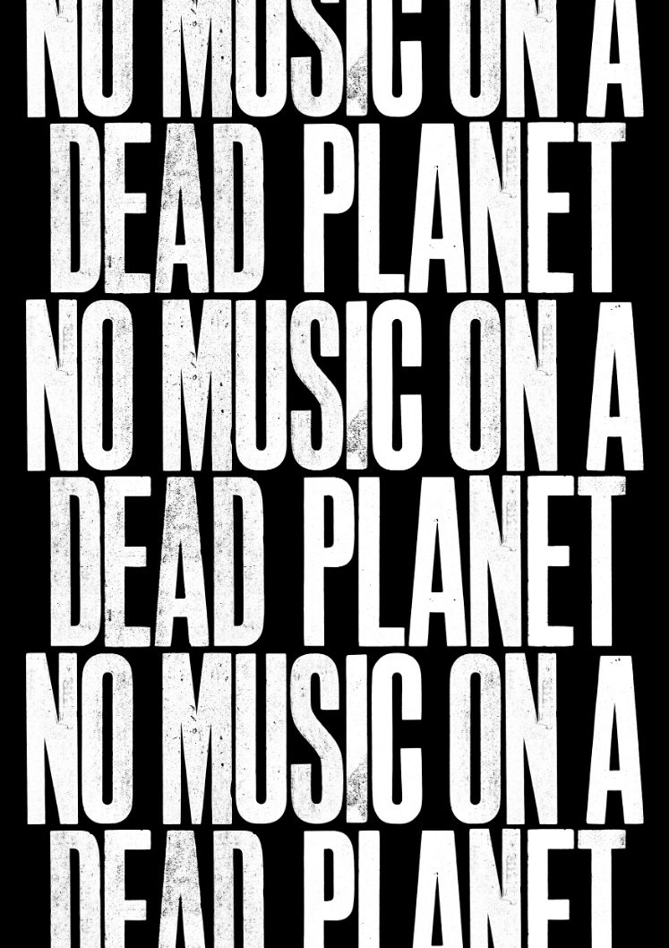
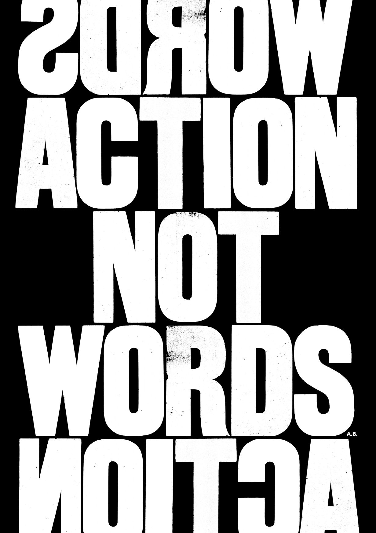
It’s undeniable – these posters are attention-seekers. Is Anthony? He can’t be. He’s so mild in voice and assertion. But he gets there another way: ‘My voice lies in the work. I’m quite a reserved character, but within the work, that’s where I make my statement, very loud and direct. It’s about persuasion, getting your message across in a way people connect with.’
Anthony’s prints recall the 1939-45 British Ministry of Information posters distributed across the country to keep up morale during the Second World War. Although the famed Keep Calm and Carry On wasn’t well known at the time, having not been used, others such as Your Courage, Your Cheerfulness, Your Resolution Will Bring Us Victory and Freedom Is in Peril / Defend It With All Your Might helped remind Anglo-Saxon minds of their intrinsic fortitude.
It’s a determination shared with the Suffragettes, whose campaign literature Anthony’s also inspired by. ‘I did a commissioned project on them a few years ago, looking into how they campaigned and the graphic language they used. They used to love the typefaces I do, and there’s a definite connection between the typography I use and what they did, it’s a visual communication that connects protest to fine art.’
It’s a beautiful simplicity, and one that’s welcomed in a world which seems to either confuse with verbose instructions and legalese, or to patronise with insufferably dull marketing slogans. But Anthony sees his art as cutting through this: ‘I was brought up by my parents with a very straightforward way of looking at the world. Life is essentially very simple and we as humans find lots of creative ways to make life more complicated than it needs to be.’
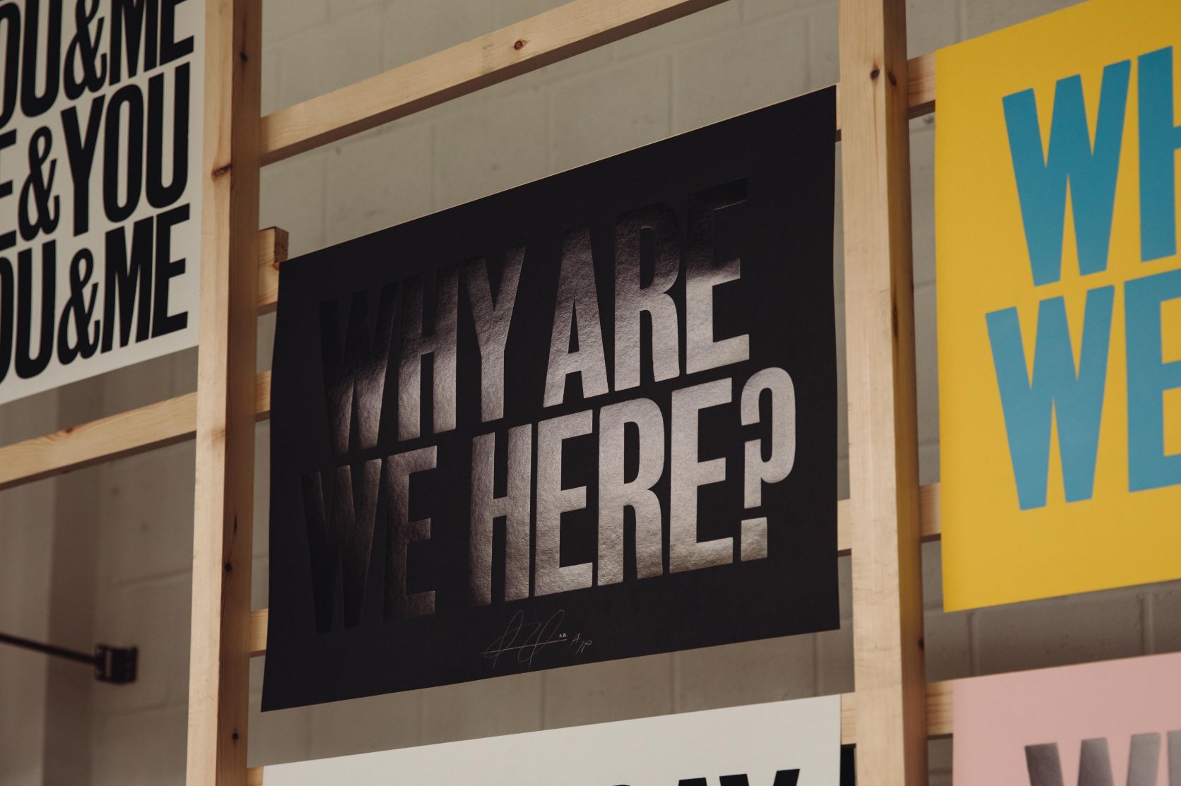
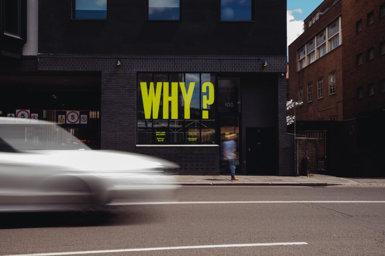
Anthony will be running a workshop – ‘Why Are We Here?’ until 10th July in One Hundred Shoreditch. For more information, click here.